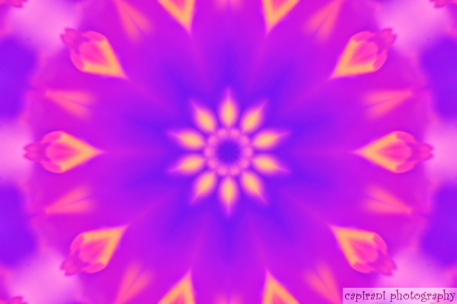
It's been a long winter; it's been a short winter. Whichever it has been for you, hopefully it has been a productive winter, a creative winter, and a healthy winter.
For me it has been a winter of exploration of art beyond and including photography. Previously I posted about using my photographs in mixed media artwork. This winter has been a time of great learning all about various types of mixed media artwork as well as the fun and addictive art of what is now known as Zen Tangle or Zen Doodle. I've spent many hours learning and practicing this art form with mixed results, most of which turned out pretty, although some were quite messy. I've incorporated them in new art journals as well as simply filling up colorful page after page of doodles in my sketch book. While some of the typical doodle patterns seem too difficult for me for now, most of them are very easy to do and gave me much new inspiration and creativity.
Along with doodling my winter away, I have found even more beautiful ways of using photography in mixed media artwork. Especially the kind of photographs I make using post editing of all sorts of photography subjects. I have always said that my designs would work beautifully in scrapbooking, but as winter comes to a close I am even more convinced that the possibilities are endless! The other day I browsed through some of my oldest designs on this blog and my other photography sites such as Flickr, and now Viewbug, only to realize that if I stopped taking photographs and turning them into strange and beautiful abstractions, I would still have an endless supply of art to use creatively in mixed media artwork.
On the other hand, while browsing, I discovered something not so wonderful, but still useful. That is that over time as I have taken on more and more new methods of creating my photographic artwork with new filters in my editing programs, I have forgotten much of what I used to do in the early days when I was still learning. This turned out to be a good value lesson for me though. I realized that it is not always necessary or even good to continually upgrade our abilities to create. While I go for the freebie options for filters and plug-ins for my editor, it shows me that maybe, at least for awhile, I should just stop looking for new things and spend more time going back over what I did in the early days. Maybe it is a good idea to re-explore everything I have right now to see what more can be done with it. There is a tendency sometimes to spend so much time with the new stuff that it can end up boring. Especially if you have allowed yourself, as I did, to forget that sometimes making do with what we already have can lead us into great discoveries.
For the next few weeks until the weather is warm enough to spend lots of time outdoors taking new photographs, my art exploration will include discovering more ways to combine my digital fusion photography with my mixed media artwork. Last year I created over 500 different patterns alone, not counting everything else I did with my photographs. Those patterns would make very interesting mixed media work. So I am thinking now that stocking up on a good supply of printer ink is very important as I am going to be printing off a lot of digital fusion artwork to be used on canvases and in art journals. I can't wait.
On a sad note, I said "Goodbye" to my Jonah. Jonah was my Shih Tsu rescue dog I had for 4 years. He was a good dog and rescued me in many ways too. After he passed, I decided to get a new companion. Meet KatieKat.
You can see Jonah's photos under the tab dedicated especially to him. He is greatly missed.
I also became a grandma for the 9th time this winter. Photos of my grandchildren remain private, however.
Below are just a few of the projects I have been working on this winter.
These are 4 examples of Zen Tangles or Doodle Art.
These photos are of my first, believe it or not, toilet paper roll mini mixed media album. I saw several videos on YouTube for how to make these cute little books and had to try it. The toilet paper rolls become the pages which include pockets to add tags to. I found that this was a great way to use the sports photographs my grandchildren give me each year. For those who for whatever reason do not want to use toilet paper rolls, you can also use paper towel rolls cut into 2 or 3 pieces.
Below are the 10 tags I made for sticking into the pockets I made. I painted one side with oil pastels and used colored pencils, notebook paper and antique buttons for the reverse side of the tags. The pencil shows just how small these little albums are. This is the same album in the photo of KatieKat above.
My Portfolio
Showing posts with label abstract art. Show all posts
Tuesday, March 8, 2016
Wednesday, July 1, 2015
Another Fun Abstract Tutorial
As I was just looking back over some of my posts and especially at previous tutorials, I thought it would be fun to do another one. So, here goes. And as usual, I'm using a really bad photo to start with. But to its credit, the photo has some really good colors and lines and textures to work with. This photo here is one of the absolute worst I have ever taken. Why it turned out so bad is a whole other post. It's just bad and it isn't the only one I took that day that turned out bad.
Remember, to get the full effect of this tutorial, double click on the photo to get full screen.
So, just to take some time out to experiment with some software settings I had not used before, I decided to see what might happen if I tried a few. This was using curves intense. This was the only one I liked. And really, it's BAD. There's nothing redeemable about it. Or is there?
Well, there is color. There are lines, angles, textures. Hmmm...
I decided to try out my favorite kaleidoscope filter from the Mehdi group. This setting was 2 petals, 0 offset, 0 rotate, and 1 zoom out. Well, now that's interesting. The more I look at it, the more I like it. Yet, I'd like a little less white.
This time I wanted to see what would happen if I worked on the
colors only. So I tried Luminares Color Glow. Wow, I love this shade
of blue, but this is a little overboard. But I'm not giving up. I'm
seeing more and more potential here. So I keep going.
Back to the ole favorite kaleidoscope. This time it was 2 petals,
46 offset, 0 rotate, and 1 zoom out. That's much better. But I'm not
finished yet.
Okay I don't really like all that blue even though it is interesting. So I back up a couple steps back to the kaleidoscope directly above the first blue picture. Yep, that's the one, with the all white pickets going across the middle and the colors top and bottom. This time instead of more kaleidoscopes, I chose to use Toadies filter group and the filter called Picasso's Other World. You can certainly see the cubism there. I am really liking this one. But let's see what else can be done.
At this point, still avoiding more kaleidoscopes because there are just times when I can almost feel that I need something totally different, I have chosen the same filter group that has the kaleidoscope filter. But this time I have chosen a filter called Melt within the Mehdi filter group.
Wanting to give it something...not quite sure what yet...but I am trying the filter group called Simple and the effect called Blintz.
Well that has possibilities, but I've still not gotten what I am looking for, and that is something that just pops out at me and says, "YES! This is it!"
So now I am going to try one more very easy filter that comes with the Paint Shop program and that is found under the title of Distortion Effects. The effect is called Displacement Map.
And that's my YES!
I could keep going, but I am going to stop there. I am happily satisfied with this result and feel that I have gotten not one but two pretty awesome pieces of art out of this. The first one is the one where I used the Picasso's Other World and got such an interesting cubism piece. And then this last one above here.
So did you follow along and do some experimenting of your own? I hope so. That's what makes this fun.
Friday, April 24, 2015
Fine Art America, Anne Geddes, and Genealogy
If you are interested in fine art, I am sure you have probably seen the Fine Art America website. If not, you can click here to check it out. As I was researching ways to learn more about selling my artwork, I saw something about Fine Art America I hadn't seen before so I decided to look into it. As I did so, I noticed something else that really surprised me. Anne Geddes, America's favorite baby photographer sells her work on Fine Art America. That sold me on it so tonight I joined the other artists there and created my own profile, uploading nine (9) of my newest pieces. A really cool thing about this site is that you can set it to connect and post to your Facebook and Twitter accounts automatically every time you upload a new piece of artwork. That takes a load off the work of marketing for yourself. Not only that, the website is free to join, and allows you to sell directly to the buyer through email which keeps it all free for the artist and buyer as far as the website goes. However, you can also sell through the website and have your art put on everything from greeting cards, to throw pillows, to duvets, and even smart phone cases and more. And as the artist, you don't have to do anything to make sure the purchaser gets their product. So, now I am looking forward to seeing how this thing works out. Before I had completed all my nine uploads, I had already noticed that 38 people had viewed my profile.
One of the parts of this fine art sales that bothers me is the business side of things. In fact, this was what I was researching so I could learn more about it. When I first submitted to Xanadu, I have to admit that I knew basically nothing about gallery sales or even fine art sales. I was looking in totally different directions at the time. So, even knowing how much I hate the business side of art, I knew I needed to do something to help me grow and learn more. This is one thing that Fine Art America is already helping me with. When I set my prices, I only have to figure out what I want to get out of each sale that is mine to keep (before taxes, of course.) When setting my prices for art galleries, I need to know what their commission is, as well as all the other things like the cost of production, etc. But with Fine Art America, you set the amount you want for yourself, and they show you the mark-up and the final cost to the buyer.
Another thing that totally shocked me as I looked over Anne Geddes profile was her low prices. I found her own website and her prices are very low for her beautiful photographs. I clicked on her puzzles link and that took me to Amazon which also has her items priced very reasonably. I was very impressed.
Oh! I have to add this side note which is really quite exciting for me and that is that during my recent trip back down genealogy lane this past week, I "met" a long distant cousin and we have been emailing back and forth ever since. And get this...she is a photographer!!! Truly amazing and wonderful. It seems that art is in our genes as we both know others in the same lineage that are artistic in nature.
One of the parts of this fine art sales that bothers me is the business side of things. In fact, this was what I was researching so I could learn more about it. When I first submitted to Xanadu, I have to admit that I knew basically nothing about gallery sales or even fine art sales. I was looking in totally different directions at the time. So, even knowing how much I hate the business side of art, I knew I needed to do something to help me grow and learn more. This is one thing that Fine Art America is already helping me with. When I set my prices, I only have to figure out what I want to get out of each sale that is mine to keep (before taxes, of course.) When setting my prices for art galleries, I need to know what their commission is, as well as all the other things like the cost of production, etc. But with Fine Art America, you set the amount you want for yourself, and they show you the mark-up and the final cost to the buyer.
Another thing that totally shocked me as I looked over Anne Geddes profile was her low prices. I found her own website and her prices are very low for her beautiful photographs. I clicked on her puzzles link and that took me to Amazon which also has her items priced very reasonably. I was very impressed.
Oh! I have to add this side note which is really quite exciting for me and that is that during my recent trip back down genealogy lane this past week, I "met" a long distant cousin and we have been emailing back and forth ever since. And get this...she is a photographer!!! Truly amazing and wonderful. It seems that art is in our genes as we both know others in the same lineage that are artistic in nature.
Tuesday, April 14, 2015
Digital Fusion With a Pineapple, a Camera, and a Computer
Pineapple is so good to eat. But have you ever photographed a pineapple? Okay, so what's so special about photographing a pineapple? And what is this thing called "Digital Fusion?"
Well, let's start with the last question first. "Digital Fusion" is what I call the art that I create using my camera and my computer, specifically my Corel Paint Shop X5 photo editing program. Over the past years as I have progressed in this specialty, I have felt hard pressed to know what to call what I do. It's photography, yet once I am finished creating, it doesn't look much like photography anymore. It's not actually digital painting either. I really enjoy cooking shows, especially Gordon Ramsay's shows, and one of the things I have learned from those shows is that when you mix different styles of cooking together, say Indian and Mexican for example, it is called "fusion." So, one day I was thinking that what I do is totally digital since I use a digital camera and everything else is done on my computer, and I am definitely fusing different things together. Hence, the name "Digital Fusion" came to my mind. I don't know if anyone else has ever used that terminology before or not, but I know for myself, I finally feel that I have found the right name and description of my art.
So, okay then, what about this pineapple and what are you going to do with it? Well, I 'm glad you asked. Let me show you.
Starting with these 4 photos, let's see what happens when I start using Paint Shop with them. First let me say that I have added a great many more filters that you can find online for free just by looking. The filters are plug-ins that help me create the art I so enjoy. I didn't really do anything with the photo of the actual pineapple...yet anyway. But I wanted to show you the different colors available from the pineapple itself. Mostly I worked with the photo of the leaves, and the bottom photo of the single segment of the side of the pineapple. You can see more here.
These 3 examples above show the vast amount of color that was provided just by the one photo of the pineapple leaves. Be sure to click on each photo to see it enlarged for better detail. My favorite among these is the center one, which I call "Florets"
Next, let's take a look at examples of digital fusion using the single segments of the pineapple skin. With the first one, I got these final pieces of art.
The second of the above examples is actually the cropped version of the first one so that the cross itself is the main focus. I have been using a Kaleidoscope plug-in to try to come up with different styles of crosses, and this is just one of many examples.
Now let's move on to the final individual segment of pineapple skin. It is more in focus and also has a larger variety of colors in the palette.
As you can see from these 4 examples above, the colors can be changed during processing. All of these kept the brick texture simply because I liked the look it presented.
So, there you have it. What I call "Digital Fusion" and why I call it that. It doesn't matter what I might find to photograph to start with. Everything has options to be used as a final digital fusion piece of art. With God as the Master Painter, the color palette provided by nature cannot be topped.
Well, let's start with the last question first. "Digital Fusion" is what I call the art that I create using my camera and my computer, specifically my Corel Paint Shop X5 photo editing program. Over the past years as I have progressed in this specialty, I have felt hard pressed to know what to call what I do. It's photography, yet once I am finished creating, it doesn't look much like photography anymore. It's not actually digital painting either. I really enjoy cooking shows, especially Gordon Ramsay's shows, and one of the things I have learned from those shows is that when you mix different styles of cooking together, say Indian and Mexican for example, it is called "fusion." So, one day I was thinking that what I do is totally digital since I use a digital camera and everything else is done on my computer, and I am definitely fusing different things together. Hence, the name "Digital Fusion" came to my mind. I don't know if anyone else has ever used that terminology before or not, but I know for myself, I finally feel that I have found the right name and description of my art.
So, okay then, what about this pineapple and what are you going to do with it? Well, I 'm glad you asked. Let me show you.
Starting with these 4 photos, let's see what happens when I start using Paint Shop with them. First let me say that I have added a great many more filters that you can find online for free just by looking. The filters are plug-ins that help me create the art I so enjoy. I didn't really do anything with the photo of the actual pineapple...yet anyway. But I wanted to show you the different colors available from the pineapple itself. Mostly I worked with the photo of the leaves, and the bottom photo of the single segment of the side of the pineapple. You can see more here.
These 3 examples above show the vast amount of color that was provided just by the one photo of the pineapple leaves. Be sure to click on each photo to see it enlarged for better detail. My favorite among these is the center one, which I call "Florets"
Next, let's take a look at examples of digital fusion using the single segments of the pineapple skin. With the first one, I got these final pieces of art.
The second of the above examples is actually the cropped version of the first one so that the cross itself is the main focus. I have been using a Kaleidoscope plug-in to try to come up with different styles of crosses, and this is just one of many examples.
Now let's move on to the final individual segment of pineapple skin. It is more in focus and also has a larger variety of colors in the palette.
As you can see from these 4 examples above, the colors can be changed during processing. All of these kept the brick texture simply because I liked the look it presented.
So, there you have it. What I call "Digital Fusion" and why I call it that. It doesn't matter what I might find to photograph to start with. Everything has options to be used as a final digital fusion piece of art. With God as the Master Painter, the color palette provided by nature cannot be topped.
Wednesday, August 27, 2014
Abstract Tutorial--Step-by-Step
Tonight I would like to take you through the steps for making some interesting abstract designs, and by using a couple of really, really bad photographs to do it. To start out, I want you to do something you will not understand at first. I want you to take a couple photos of your hair, or the hair of someone else who will allow you to do so. Now you can make this photo sharp and in focus, or only slightly focused. In the case of this tutorial, it would be cool if you can photograph the hair against a colorful background such as a shirt.
Okay, now stop laughing. I'm serious here.
In all honesty, hair has some really neat lines and colors that you don't notice unless you have taken a macro shot or otherwise close-up shot of it. What we are going for tonight is the lines mixed with the backgrounds. Take several shots. You can always delete them later if you don't like the results.
Here are the photos I am going to use tonight.
I warned you that the photos I would be using tonight were really bad. My 12-year-old granddaughter was sitting on the arm of my chair watching TV when I just pulled out the camera and tried to get a good macro shot. The only thing is, she kept fidgeting so the photos were blurred. So, let's get started.
Okay, before we move on, let's talk software. I am using Corel PaintShop Photo Pro X5. So I may have different filters and effects than you have if you are using some other program. There are lots of free programs out there as well. I love this one because it is not so expensive, but does a lot of things. But use whatever you have handy. If you don't have any program as yet, just bookmark this page and come back to it once you have a program downloaded.
I LOVE kaleidoscopes. I loved them as a child and never really outgrew the appeal. So I almost always start out creating a kaleidoscope design first. I have found that often, if the photo will not do well with a kaleidoscope, it probably won't do well with other filters or effects either. Unless there is a lot of color. Then all kinds of things can happen with your software.
So, I set the effect for a kaleidoscope. All of the settings were set to zero except for the number of petals, and the setting for "reflect" was checked. This was the first result.
Check it out on full screen by clicking on the picture. See all those tiny lines? Those are the hairs!! Now you could stop here, but I didn't. I just had a feeling I could come up with something more.
For this next result, I kept the kaleidoscope and went to my effects filters and chose one from the group called "Fun House." The one I chose is called "Sierpenski's Mirror." Now within this filter there are various setting possibilities. No two photos will ever turn out exactly the same unless you write down the settings you chose and keep very detailed notes. I don't do that, so each of my designs remain totally unique. It's up to you whether or not you want to do that for yourself. I didn't like the result so much but I knew I could do something with it, so I added another filter on top. This filter came from the "Simple" group and I chose the "Diamonds" filter. But you can use whatever you like, and stop or continue on as long as you like. You will eventually find that going on further does not make the design much better so you end up learning that there is a time to stop.
Here is the result.
Now this almost looks like a piece of paper that has been folded many times. Again, click the picture for a full screen look. I chose this place to stop, for now. I might end up going back at another place in time to change it more, but I doubt it. You will understand more when I show you what happened with the second bad photo.
Now if you go back up and take a look at the two bad photos, you will see that the bulk of the hair is to the left on the top photo and to the right on the bottom photo. The loose hairs spread out over the rest of the photo. Also the stripe in the shirt has switched sides somewhat. Will this make much of a difference? Let's find out.
Once again I started out with the kaleidoscope effect using the same exact settings that I used the first time. An interesting thing you will learn as you use your software often enough, is what kinds of quirks it has. For instance, I've learned that this kaleidoscope setting pretty much takes the color that is toward the lower right/bottom of the photo and makes that the outside color of the photo. I learned this when I found that I could create kaleidoscopes from scratch using the paint part of the program and use all kinds of colors, yet only a couple colors would show up in the results. So learning where to place the colors you want to show in your results can be important. Again, it's the strands of hair that form the lines of the design.
This time I decided to try a different effect, so while keeping the kaleidoscope, I went to the effect called "Artistic Effects" and chose one called "Glowing Edges." While doing this tonight I think I learned something else about my software. Normally this selection makes one of those black glowing pictures that you will see on red velvet type things. But this time it turned blue!! The only reason I can tell is that I had blue up in the paint color palette. I do know that whatever color I have up as last used in the color palette can effect the colors of the filter chosen. I had not seen this happen before, though. It's always fun to find out new little tricks to play around with. Having this come up in my favorite shades of blue wasn't bad either.
This was one of those "ooooh!" moments I sometimes have when I am in the zone creating these abstracts.
After this I chose an effect from the group called "Distortion Effects" and chose the distortion called "Polar Coordinates." Within that are two options plus other settings. I almost always use the "Polar to Rectangular" rather than the "Rectangular to Polar." Again, it is up to you what you choose. The best way is to play around with the program to see what you like. The more you like a setting, the more you will use it. Something I like about this PaintShop Photo Pro program is that they have a setting where you can choose random settings with which you will never know what you are going to get until it happens. That can be fun if you are looking for something different. I suggest that if you do this, you keep notes of those settings you really like so you can find them again.
Okay, here is the polar coordinates result.
For awhile I was doing these with almost every design I played around with. You can see more of these on my Flickr photostream.
But I did not want to stop with this one. So I continued on thinking that maybe I might even be creating a wall grouping with these beautiful blues. Next I again chose the "Simple" filter and this time I chose one called "Zoom Out and Flip." (By the way, you can search the net for free downloadable filters for many of the programs available today. That is how I got most of mine, although some come with the program.)
Here's the result of Zoom Out and Flip...
Once again I was pleasantly surprised. Normally, this setting does some crazy flip-flopping of the photo. This time it didn't and I think this was actually better than what I was expecting.
Finally, I went back to my favorite Kaleidoscope effect. I guess I was thinking of bookends??? Who knows? When I get into this, sometimes I get ideas that may or may not make sense. But here is the final abstract I came up with.
There you go. This is how I make most of my graphics. There really are times when I don't use the kaleidoscope effect photo even though I almost always start out with them. There are times when I use all sorts of other effects and end with the kaleidoscope. Sometimes I never use the kaleidoscope. But if you followed along here, and actually created your own abstract of your hair or someone else's hair, I am sure you came up with something spectacular. If you enjoyed this tutorial, keep playing around with your software program and see what kinds of things you end up with.
If you enjoyed this tutorial, please let me know. Also, please share it with your social media groups. I may add more tutorials if this one is popular enough. Thanks for spending your time with me.
Okay, now stop laughing. I'm serious here.
In all honesty, hair has some really neat lines and colors that you don't notice unless you have taken a macro shot or otherwise close-up shot of it. What we are going for tonight is the lines mixed with the backgrounds. Take several shots. You can always delete them later if you don't like the results.
Here are the photos I am going to use tonight.
I warned you that the photos I would be using tonight were really bad. My 12-year-old granddaughter was sitting on the arm of my chair watching TV when I just pulled out the camera and tried to get a good macro shot. The only thing is, she kept fidgeting so the photos were blurred. So, let's get started.
Okay, before we move on, let's talk software. I am using Corel PaintShop Photo Pro X5. So I may have different filters and effects than you have if you are using some other program. There are lots of free programs out there as well. I love this one because it is not so expensive, but does a lot of things. But use whatever you have handy. If you don't have any program as yet, just bookmark this page and come back to it once you have a program downloaded.
I LOVE kaleidoscopes. I loved them as a child and never really outgrew the appeal. So I almost always start out creating a kaleidoscope design first. I have found that often, if the photo will not do well with a kaleidoscope, it probably won't do well with other filters or effects either. Unless there is a lot of color. Then all kinds of things can happen with your software.
So, I set the effect for a kaleidoscope. All of the settings were set to zero except for the number of petals, and the setting for "reflect" was checked. This was the first result.
Check it out on full screen by clicking on the picture. See all those tiny lines? Those are the hairs!! Now you could stop here, but I didn't. I just had a feeling I could come up with something more.
For this next result, I kept the kaleidoscope and went to my effects filters and chose one from the group called "Fun House." The one I chose is called "Sierpenski's Mirror." Now within this filter there are various setting possibilities. No two photos will ever turn out exactly the same unless you write down the settings you chose and keep very detailed notes. I don't do that, so each of my designs remain totally unique. It's up to you whether or not you want to do that for yourself. I didn't like the result so much but I knew I could do something with it, so I added another filter on top. This filter came from the "Simple" group and I chose the "Diamonds" filter. But you can use whatever you like, and stop or continue on as long as you like. You will eventually find that going on further does not make the design much better so you end up learning that there is a time to stop.
Here is the result.
Now this almost looks like a piece of paper that has been folded many times. Again, click the picture for a full screen look. I chose this place to stop, for now. I might end up going back at another place in time to change it more, but I doubt it. You will understand more when I show you what happened with the second bad photo.
Now if you go back up and take a look at the two bad photos, you will see that the bulk of the hair is to the left on the top photo and to the right on the bottom photo. The loose hairs spread out over the rest of the photo. Also the stripe in the shirt has switched sides somewhat. Will this make much of a difference? Let's find out.
Once again I started out with the kaleidoscope effect using the same exact settings that I used the first time. An interesting thing you will learn as you use your software often enough, is what kinds of quirks it has. For instance, I've learned that this kaleidoscope setting pretty much takes the color that is toward the lower right/bottom of the photo and makes that the outside color of the photo. I learned this when I found that I could create kaleidoscopes from scratch using the paint part of the program and use all kinds of colors, yet only a couple colors would show up in the results. So learning where to place the colors you want to show in your results can be important. Again, it's the strands of hair that form the lines of the design.
This time I decided to try a different effect, so while keeping the kaleidoscope, I went to the effect called "Artistic Effects" and chose one called "Glowing Edges." While doing this tonight I think I learned something else about my software. Normally this selection makes one of those black glowing pictures that you will see on red velvet type things. But this time it turned blue!! The only reason I can tell is that I had blue up in the paint color palette. I do know that whatever color I have up as last used in the color palette can effect the colors of the filter chosen. I had not seen this happen before, though. It's always fun to find out new little tricks to play around with. Having this come up in my favorite shades of blue wasn't bad either.
This was one of those "ooooh!" moments I sometimes have when I am in the zone creating these abstracts.
After this I chose an effect from the group called "Distortion Effects" and chose the distortion called "Polar Coordinates." Within that are two options plus other settings. I almost always use the "Polar to Rectangular" rather than the "Rectangular to Polar." Again, it is up to you what you choose. The best way is to play around with the program to see what you like. The more you like a setting, the more you will use it. Something I like about this PaintShop Photo Pro program is that they have a setting where you can choose random settings with which you will never know what you are going to get until it happens. That can be fun if you are looking for something different. I suggest that if you do this, you keep notes of those settings you really like so you can find them again.
Okay, here is the polar coordinates result.
For awhile I was doing these with almost every design I played around with. You can see more of these on my Flickr photostream.
But I did not want to stop with this one. So I continued on thinking that maybe I might even be creating a wall grouping with these beautiful blues. Next I again chose the "Simple" filter and this time I chose one called "Zoom Out and Flip." (By the way, you can search the net for free downloadable filters for many of the programs available today. That is how I got most of mine, although some come with the program.)
Here's the result of Zoom Out and Flip...
Once again I was pleasantly surprised. Normally, this setting does some crazy flip-flopping of the photo. This time it didn't and I think this was actually better than what I was expecting.
Finally, I went back to my favorite Kaleidoscope effect. I guess I was thinking of bookends??? Who knows? When I get into this, sometimes I get ideas that may or may not make sense. But here is the final abstract I came up with.
There you go. This is how I make most of my graphics. There really are times when I don't use the kaleidoscope effect photo even though I almost always start out with them. There are times when I use all sorts of other effects and end with the kaleidoscope. Sometimes I never use the kaleidoscope. But if you followed along here, and actually created your own abstract of your hair or someone else's hair, I am sure you came up with something spectacular. If you enjoyed this tutorial, keep playing around with your software program and see what kinds of things you end up with.
If you enjoyed this tutorial, please let me know. Also, please share it with your social media groups. I may add more tutorials if this one is popular enough. Thanks for spending your time with me.
Wednesday, August 6, 2014
More Learning
Well, I have to say that doing the tutorial lessons with Jason Horejs is working well, somewhat. The assignments do require that I buy his book which I have not done yet. But otherwise I am learning at least a few things. One of those things is about branding and all that goes with that topic. So far, I am learning that people need to be able to look at my work and recognize that it is mine. So what sets me apart from others? Right off hand I would say that it is my abstracts. Especially the kaleidoscopes. That has me thinking that maybe I need to totally remake this blog and the page two section of this blog which is all graphics. I am just not sure yet how to do that so that it is better, easier to use, and more organized. It will take a whole lot of time and work because I have very few of the photos on my computer anymore. They are all on flash drives and CD's. In the meantime, I am still at work creating new abstracts and taking more and more photos. I am learning more and more about my Canon EOS Rebel T3i also. I think I finally know how to change the shutter speed AND the aperture. That really had me baffled for awhile.
Also, now that I am on Flickr I have been doing some interesting searching using town names of places where I have lived throughout my life. In doing this, so far, I have met a new friend who went to the same high school as I graduated from, only several years apart so we did not know each other back then. How interesting! And how interesting to find photographs from the places I have lived on Flickr!
Last week, we got a bunch of fresh produce and as I was cooking some fresh from the garden cabbage, I took these photos. Tonight I also did a few abstracts as well of both the cabbage and some clover that I photographed last month. Also in the photos this time are some other fresh veggies.
These colorful designs below are from the clover, which, by the way, is actually lavender. But somehow with the extension tubes on my camera, this is the color they turned out.
On these two below I tried something I had never done before. I took the original pattern design and then used the color fill in color changer mode, clicked on one small area and this is how it turned out. Then I added a new color for the final design.
Obviously this must be the cucumber kaleidoscope. What fascinates me here is how deep this looks. It is almost 3D.
These below are the green beans in kaleidoscope and patterns. Very unique, I think.
Also, now that I am on Flickr I have been doing some interesting searching using town names of places where I have lived throughout my life. In doing this, so far, I have met a new friend who went to the same high school as I graduated from, only several years apart so we did not know each other back then. How interesting! And how interesting to find photographs from the places I have lived on Flickr!
Last week, we got a bunch of fresh produce and as I was cooking some fresh from the garden cabbage, I took these photos. Tonight I also did a few abstracts as well of both the cabbage and some clover that I photographed last month. Also in the photos this time are some other fresh veggies.
These colorful designs below are from the clover, which, by the way, is actually lavender. But somehow with the extension tubes on my camera, this is the color they turned out.
On these two below I tried something I had never done before. I took the original pattern design and then used the color fill in color changer mode, clicked on one small area and this is how it turned out. Then I added a new color for the final design.
Obviously this must be the cucumber kaleidoscope. What fascinates me here is how deep this looks. It is almost 3D.
These below are the green beans in kaleidoscope and patterns. Very unique, I think.
Subscribe to:
Posts (Atom)